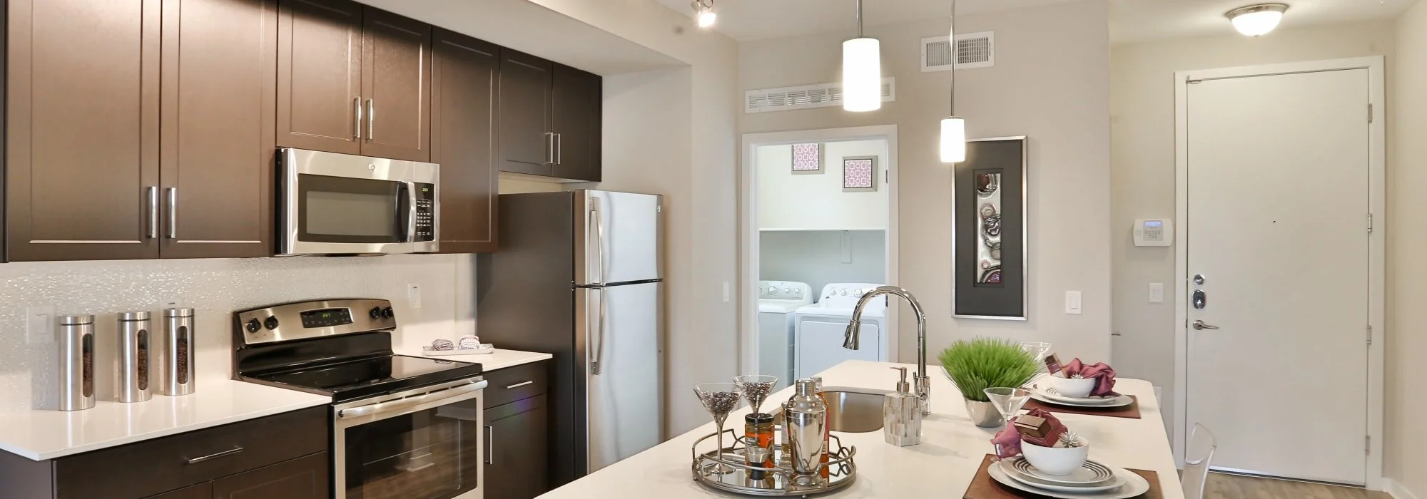
To attract residents, especially good residents, property managers need to represent their property in the best possible light. Prospects need to see your unit as accurately as they can in their minds eye. This is even more true in the wake of COVID when prospects are being more selective when determining which units to tour in person.
A few stats bring this point home:
An estimated 60% of people are more inclined to click on a local search if it has an image.
Web pages with photos get 94% more views than those without images.
When searching for properties online, renters spend nearly two-thirds of their time looking at property images.
However, not all property managers have the ability to hire a professional photographer. Instead, they can focus on improving their photographic talents to help lease apartment units faster.
Here are a few 'shutterbug' tips for property managers looking to take more moving images that better showcase their properties online.
Follow "the rule of thirds."
The fundamentals of photography are the basics for a reason; they pertain to everything. The main one to consider is "the rule of thirds." The rule of thirds recommends that the image be arranged in thirds, horizontally and vertically, essentially separating the frame into nine imaginary, equal parts similar to the photo grid frame on a typical iPhone. The image's focal point should be at the crossing of two imaginary centered lines or within a box that represents that point. Using this rule ensures a neat and visually attractive appearance.
Dress to impress.
Nobody likes a mess in a model unit. The sight of a kitchen towel on the back of a chair, pillows all askew, dirt or even just footprints in carpet or on laminate is often not well received by a camera lens. Tidy always wins. If you don't want to do clean up yourself, hire someone on your behalf. If an IRO rental comes unfurnished, you may want to think about staging your unit. Rooms with furnishings look more homey, appealing, and can look bigger.
Utilize natural light.
Brighter always looks better and can bring a space to life. It is advised to photograph without a flash as flashes can make specific images appear washed-out.
Add focal details.
When staging your unit for the shoot, consider adding prime focus points to the full view image. These catch the eye and make the image more appealing—a 'pop' of color from a well-placed cushion, for example. Flowers on the table or a bowl of colorful fruit are also useful props.
Pick the right angle.
It can be hard to photograph a room, especially if you're standing in the middle. Try setting the camera at the height of 5-6 feet and positioning yourself in the room's corners or the doorway. You aim to present a realistic view of the space. Also, get yourself a tripod. They are low-priced and merit the investment; you don't want unsteady hands to become a factor.
Highlight unique features.
Be sure to photograph the property's unique features. For example, if you have high-end appliances, a large balcony, an upgraded bathroom, or a newly renovated deck, these should be front and center. These unique features will stand out and captivate a prospects' attention.
Keep photos straight.
Level sight-lines are super important. You don't want to be taking crooked photos. Don't fret too much at the time of taking the picture, but recognize that you will want to edit and align any photographs before publishing them online.
Take "too many" photos.
More allows you to pick, choose, and refuse what depicts your unit in the best light. Snap as many photographs as you think you might need, and then take five or seven more shots. When you're going over them later, you may feel that the first image you took is the best, but often notice that the 3rd, 4th, or 5th is even more useful. Taking lots of pictures presents you plenty of options and means you can experiment a little with your focal points, angles, and positioning and not need to return the unit after that.
Edit your images.
While you don't want to be deceptive, there's nothing wrong with editing your images to highlight your property's appeal. The four main preparational steps are lightning, cropping, straightening, and resizing.
A few points to keep in mind:
Lighter photos are more pleasant and more welcoming to view.
Cropping out excess ceiling or a bare wall, for example, will provide the best framing for the image.
Be sure all the vertical lines in the image are straight, e.g., cabinets and window frames.
Resize for the web. If you've used a DSLR camera, you will likely have a very high-resolution image. This is an excellent native file to have, mostly if you intend to print flyers from them. For example, that may be too large for use online due to possible slow downloading, which works against you as it increases your bounce rate. Therefore you will want to compress those pictures.
In today's day and age, eye-catching images are critical to a successful leasing strategy. These tips will help property managers take their pictures while still professionally presenting the property. The more photos, the better, and ultimately, the faster you'll rent your apartments as a result.
